Images
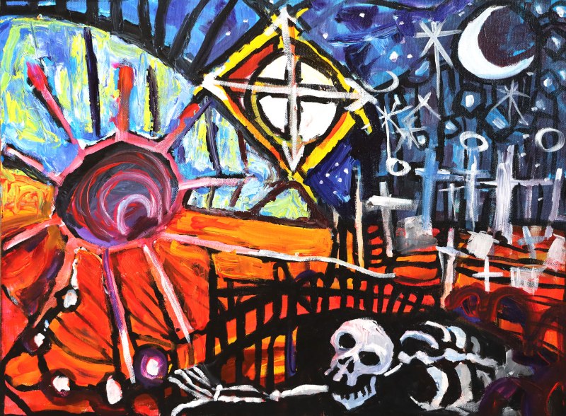
I ain’t Dead Yet!

Acrylic on Canvas. A painting about resilience.
Pinkphobia


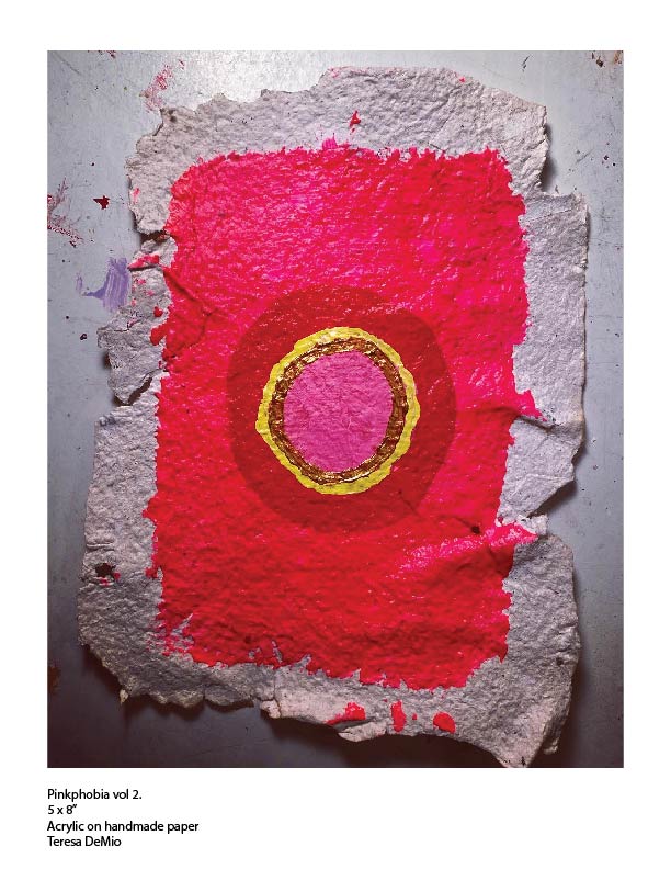
Acrylic on handmade paper. Currently on view at Up Front Art Space, 127 Portage Trail, Cuyahoga Falls, OH
This piece is an attempt to deconstruct and decontextualize the color pink.
Pink is so closely associated with femininity that we’ve completely separated it from what it actually is: a shade of red.
Pinkphobia invites us to ask ourselves; why are we, as a society, scared of the color pink?
Can we re-integrate this color as a part of the spectrum of our human experience?
Can we neutralize the brand of femininity, and that which we attribute to the feminine experience?
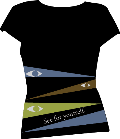
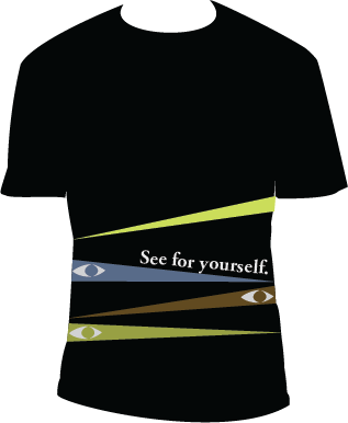
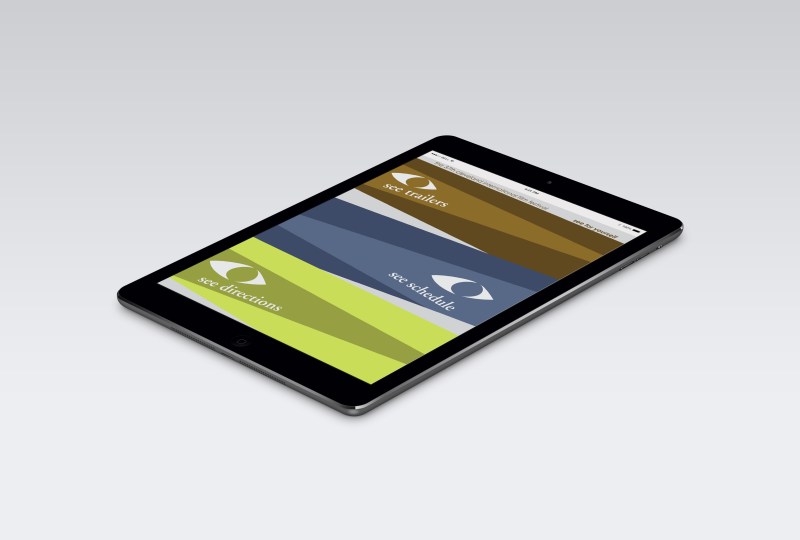
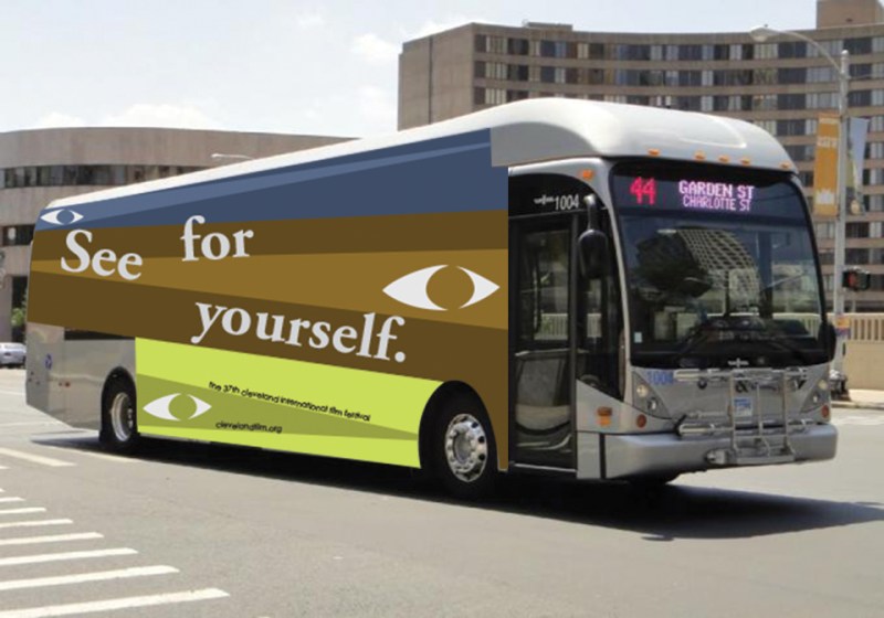
CIFF promotional campaign: See For Yourself

This campaign for the Cleveland International Film Festival is based on the tagline “See For Yourself.”
The color scheme is that of the three basic eye colors. The elongated triangular shapes refer to the light from a projector in a movie theater. I designed a poster, app, and vehicle wrap, to promote the Film Festival on various platforms.

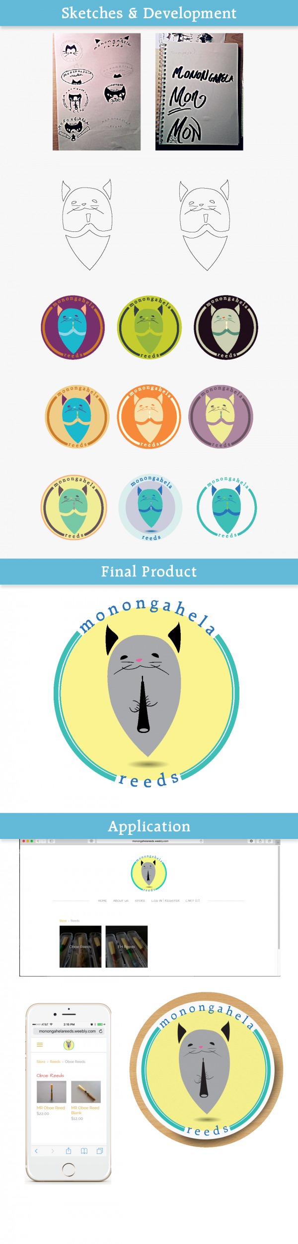
Monongahela Reeds Logo

This is a logo I created for Monongahela Reeds, which is a company that specializes in making quality reeds for oboe and English horn.
This is a very special company that is comprised of both human oboe and oboe reed experts, and animal “reed elves”.
The name of this company’s mascot is “Gray Baby,” an adorable oboe kitty who went from road-rescue to oboe logo superstar. Read more about Gray Baby here:
http://monongahelareeds.weebly.com/about-us.html
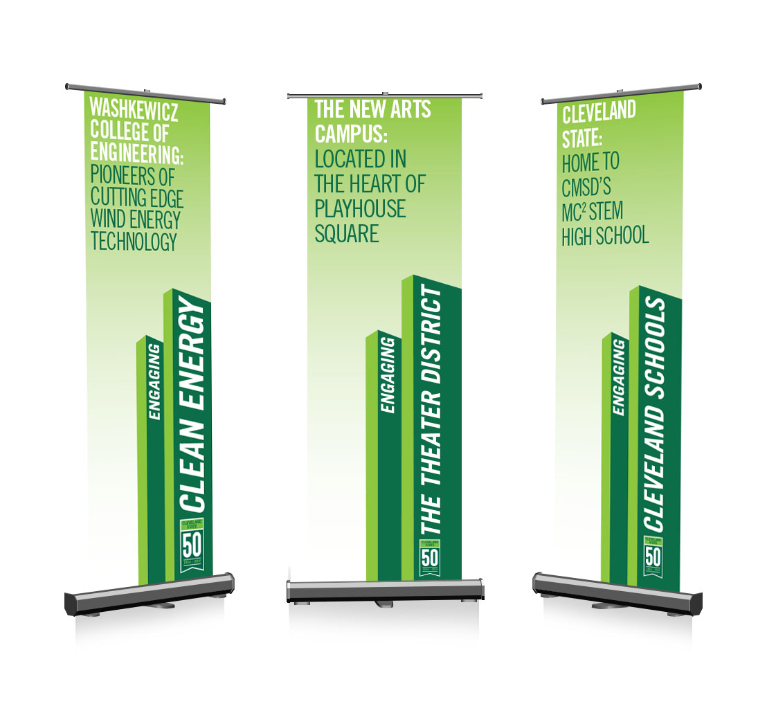
My Design for CSU’s 50th Anniversary: Celebratory Banners
2014 is the year that Cleveland State University turns 50 years old.
To celebrate the 50th anniversary of my alma mater, I have designed a banner series which highlights some of the bragging points of Cleveland State.
I used Adobe Illustrator to create a clean, simple vector design that supports the readability of these banners.
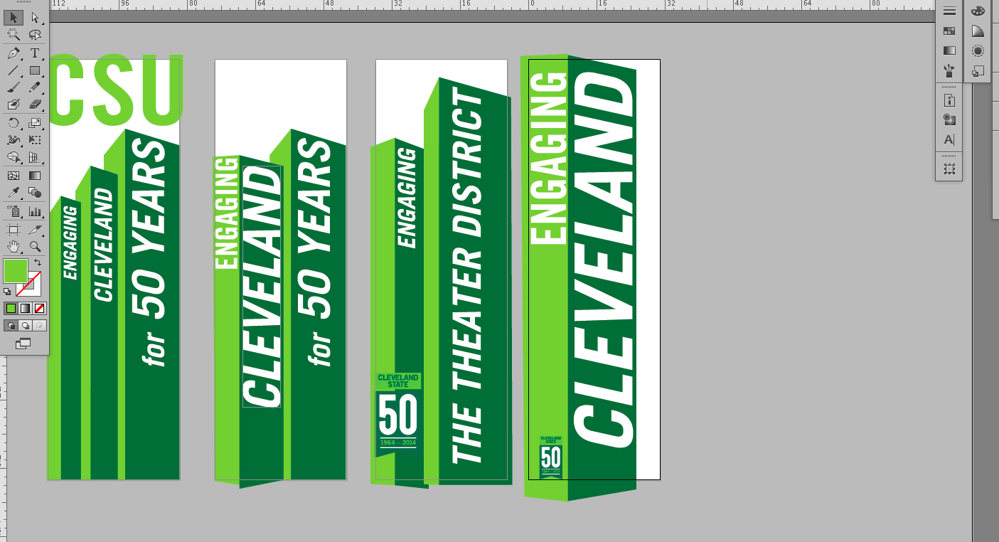
Here is the finished design!
Skull, Kettle
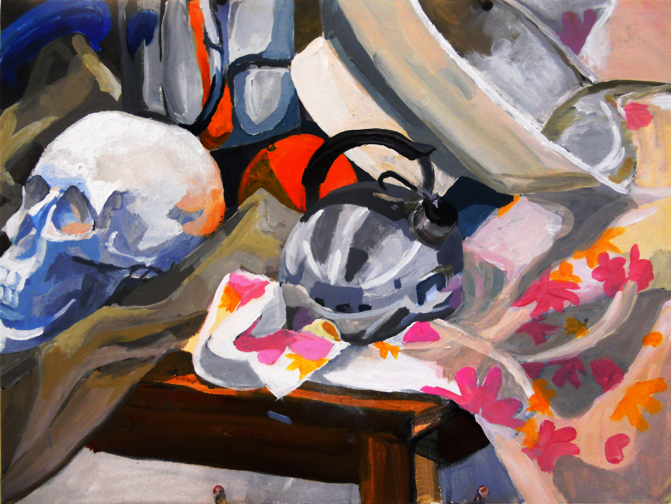
Student show opens next Friday, the 29th; CSU art gallery on Euclid ave.
I hope you can make it!
